Uncovergrowth markets
Uncovergrowth markets
[9 minutes read]
Company Profile
Name: TimoCom
DE, Düsseldorf, SaaS, Enterprise, B2B
“All of TIMOCOM is united by a common vision for the future of logistics. As a FreightTech company, we believe in a world without logistical challenges. We have therefore made it our mission to make logistics smart, safe and simple. We call this future: Augmented Logistics.” [timocom.co.uk/…/about-us in 2021]
My TimoCom backstory
During the 8 years working for TimoCom I started in the Marketing Department and helped in the core group to create a completely new brand design.
From 2010 I was invited to start as first product designer in the development department. In four years I’ve founded TimoComs first product design team of four and together we aligned the 2 existing apps with the new brand design. Later, in partnership with the leadership team, we created and launched the new two products TC eMap and TC eBid.
Business objective 2014
But at the end of 2013 we realised that we couldn't keep up with the competition from Poland in our current form. In addition, there was no longer any growth in many markets in which TimoCom was active.
That's why Jens Thiermann, owner of TimoCom, Europe's largest digital freight exchange, took a bold step at the beginning of 2014. He founded the subsidiary Ticonex with the aim of discovering new growth markets and introduce new competitive web technologies. At the core of this endeavor was an entirely new innovation team.
"Adopt modern web technologies to develop competitive products that enable weak markets to become strong growth partners."
Topics
[Top screenshot]
The screenshot above shows a real search on the main product TC Truck&Cargo. As lead designer, I was completely responsible for UI and UX design until the end of 2013. When you read this on a device in landscape format it's easy to spot a lot of whitespace on the left and right of the table. The reason for this was simply that we had no one on the development team who could implement modern responsive web application design.
Data & growth opportunities
Data & research
Customer Feedback
From a business perspective there was a huge issue that we had only Germany as a very strong market. Sales in the country of our headquarters exceeded almost all other sales from other countries in Europe in which TimoCom offers its services.
The sales team was in regular communication with all customers in each of our markets in Europe. The question was regularly asked in surveys as to why customers are so inactive on our platform. The most frequently cited reason was that there were simply too few offers.
Data research
Some ad hoc experiments with our application showed that there is at least low supply in weak markets. However, these could only be found with difficulty or not at all using the search of our main product TC Truck&Cargo.
The way the search for freight or a truck worked was that a square area around the start and destination points was scanned for offers. No offers could be found that might have existed along a route. Therefore, there was currently no effective way for our customers to recognise and use the available offer potential.
Growth chain reaction
The idea was that if we could make this potential visible to our customers, this would in turn invite them to enter further offers on our logistics platform. This could trigger a growth chain reaction that turns weak markets into strong pillars for our business.
Next topic
[Top screenshot]
In the screenshot above you can see two TimoCom products that were first on the market, TC Truck&Cargo and TC Profile. Both were displayed in separate windows despite being used together in the most common user journeys.
Constraints & problems
Constraints & problems
No UX discovery
Although I had set up a pretty good product design team in the last 4 years, I hadn't had the opportunity to introduce modern UX design processes. The quickest and most obvious solution was always desired and that was then implemented.
No regular research on data
The experiments with data described in the previous article were a good start at the time. However, they did not yet follow a professional framework that could ensure quality and unbiased results.
Different tech platforms
Many products were built on different software platforms and didn't consider up to date web technology. It took a lot of effort and exceptions for us in the product design team to make all products similar, at least in terms of UI and Brand Design.
Multiple products for one user journey
Even if customers were paying a flat rate for the whole package, the platform was split into four main products. The UX on each product was quite different, but the main user group needed minimum two of those to do their daily job.
No responsive UI Design
Within the structure of the development department, it was not possible for us to introduce new modern UI and UX designs methods. For example, our icon were still delivered in PNG or GIF format with a resolution of 16x16 pixels.
Next topic
Inspire for more
Inspire for more
Innovation team for Aurora
Under the new project name Aurora at Ticonex, we were able to start completely from scratch. All that was missing was someone who can kick off a new design area in the new cross functional team. With my certification as Usability Engineer in 2012 I saw the opportunity to use these new UX methods to support Ticonex to innovate successfully.
Connect via API
As described, the various products were too different to be able to benefit from synergy effects. That's why we decided to set up a completely new tech stack with the latest web technologies. The backend with the data of the live application should be connected via API.
Code the prototype to be faster
I remember Fritz, the front and developer, just coming to me with this idea out of nowhere. Sounded super logical, but how was I supposed to work directly on the application in Node and Angular JS? The way we worked and fit together was like magic. We actually managed to test with a real prototype and real data in every Design Sprint.
Quantitative Feedback
Following design thinking principles we wanted to be able to test and measure the success of an experiment for every Design Sprint. To get quantitative data we always planned where we could add a tracker into the code and defined what a success would look like.
Qualitative feedback from B2B customers
What we did not have in the cross functional team, was a user researcher. Since we built this web app for B2B customers, there was no way around getting in touch directly with them. Luckily I was able to convince members of the sales team to organise regular user testing. Together we built a loop of regular user surveys with real customers to get first hand qualitative data.
Next topic
Process & iterations
Process & iterations
Bi weekly Design Sprints
We had good conditions and good equipment as a cross-functional team. Together we shared a large office by having the latest hardware and a really huge whiteboard.
We had prepared everything so that we could continue to work regularly with quantitative and qualitative data from user feedback in the future. This made it easy for us to quickly decide on the new “Design Sprint” method as a process.
1. Empathise
More and more data came in, which we dealt with in the first section of our Design Sprint. What was new was that user opinions played an increasingly important role. This dramatically increased the ability to better understand our users.
2. Define
In the second step, we thought about what basic problems actually existed. By clearly identifying what actually needs to be done, we were able to better prioritize the challenges.
3. Ideate
For this part of the process, we typically held whiteboard sessions physically in our office. At the same time as finding ideas for solving the problems, we were able to better estimate how much effort would be necessary to develop a solution.
4. Prototype
This is where the new method was used to simply omit the process of hi-fi prototyping. Using rough mockups on the whiteboard or tablet PC, I coordinated directly with the product manager and the front and backend developers what we wanted to create.
In a new branch of our repository, I quickly received a rough structure from the front-end developer in which I could directly implement the UI and UX design of the prototype. At the same time, front and backend developers worked on connecting the real data for testing in the background. Together we were able, among other things, to prepare a new version of the application for the next user test.
5. Test
As mentioned above, I convinced two sales colleagues to conduct user testing. In coaching sessions, I introduced the two of them to the basics of user survey methodology, which I had learned as a usability engineer at the Fraunhofer Institute in Bonn. For the user testing itself, I provided them with a new moderation guide in Microsoft Word.
The colleagues from the sales team tried to invite at least 5 customers to the user test every two weeks, which they succeeded quite well. Together we finalised the moderation guide and I added the link to the prototype currently being tested.
In order to test the new prototypes with users, we converted a small room into a makeshift test laboratory. We provided hardware that we learned was roughly the same as that used by our personas. The interviewer was present during the test and we were able to add additional observers via a webcam.
The user interviewers preferred to print out the moderation guide and take notes. Since they had other tasks as members of the sales team, they put together a short summary of their observations and key findings in a Word document for us.
Iterate
Of course, the Design Sprint process was not linear. Loops often occurred in all steps or it was necessary to return to previous stages of the process. But overall, in a good 90% of cases we were able to stick to our two-week rhythm for a Design Sprint.
Sure, a Design Sprint can in theory be completed in a week. In practice, with this extensive project with the resources we had, we couldn't do it in a shorter time.
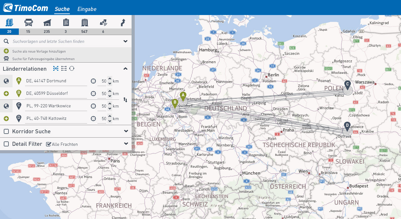
[Top screenshot]
Above is a screenshot of an early prototype. The routes are not yet colored and I use basic components and icons from the Twitter Bootstrap framework.
Next topic
[Top image]
The image above shows screenshots of the different colors I tried in the Code Sandbox to provide the best solution for the routes on our map.
User research findings
User research findings
Stats TimoCom platform
Today, the platform has customers from 44 European countries and supports 25 languages.
Back in 2014, TimoCom offered the four products TC Truck&Cargo, TC Profile, TC eMap and TC eBid. The fifth product planned was TC Warehouse.
Personas & Missons
We had identified about three large customer groups that were represented in roughly equal numbers.
Free logistic manager
The free logistic managers did not have their own trucks or goods to transport. They used our freight exchange application as a trading platform to either find free spaces or ensure a truck was fully loaded.
Fleet manager
The next large group were fleet managers in logistics companies with their own truck fleet. Here, trucks were often on recurring trips and often had the problem that the return trips were empty.
Goods logistician
The last important group were goods logisticians who worked for companies that did not maintain their own truck fleet. Similar to the fleet managers, this group also often had to deliver goods on a regular basis. That's why their focus was on finding cheap empty space in a vehicle.
Preferred work environment
In more than 80% of those surveyed, the users work was carried out at a standard desk.
The most important tools were a telephone and a PC with a larger than usual monitor.
Key findings
Fear of missing out on an offer
The main task of our users was observing the market for either offers of freight or empty space in trucks. Every row, representing an offer in the result table of our platform, was necessary and could hold the next important deal.
The update button above the offer table was sometimes pressed several times during a second to update it, as new offers were not automatically displayed.
Fear of being scammed
The next major stressor was the fear of losing money to a fraudulent company. Each fleet manager had developed their own indicators for identifying a company with fraudulent intentions. The telephone played a crucial role here. With our product TC Profile, the phone numbers of the providers could be found very quickly. For this reason, the companies were always called personally before the deal was concluded.
Two separate TimoCom products were used for these tasks alone, TC Truck&Cargo and TC Profile.
Fear of goods being stolen
Another product was mentioned which was used to provide security. The web application TC eMap, which was previously completed under my design leadership, was able to track goods and vehicles. This created greater security that goods did not simply disappear and that the truck reached its destination safely and on time.
Next topic
Final design solution
Final design solution
Map in the center
Our main business goal was to make small offers visible along a route. The best solution for us after several iterations was to better visualise the search results using a map.
Inspire for more
Sandbox for Designers
The particularly close connection between design and development in our cross-functional team has made it possible to create the best solution of the map. I was able to experiment with different designs in a sandbox and test them with real users using real live backend data.
Design System in code
It's incredible how everything becomes easier when you don't use an application like Figma to develop the design system.
I simply created an overview page with all the elements used, colors, fonts, icons and components. This meant that even before Figma, different versions were possible that I shared with everyone in the team via branches and a common repository.
Filling whitespace
In the last 4 years as product designers at TimoCom, we have created a very compressed filter layout over hundreds of iterations. Restrictions that were given to us by the developers have resulted in wide strips of whitespace appearing next to the offer list on now normal monitors with HD resolution.
Space for the 'Recurring Favorite Routes' filter.
As mentioned in the previous article, the fleet managers and goods logisticians personas have in common that they have to process recurring orders.
The new process of programming the hi-fi prototype directly after sketching the lo-fi version on a Samsung tablet accelerated my learning curve significantly. I learned how to create a modern, responsive web application in Sass, CSS, HTML and Angular JS. This allowed me to simply place the filter from the spot at the top of the results table to the left onto the empty white space.
This also meant that the UX journey was better received because it could now start on the left, like reading, and then continue on the right.
User journey
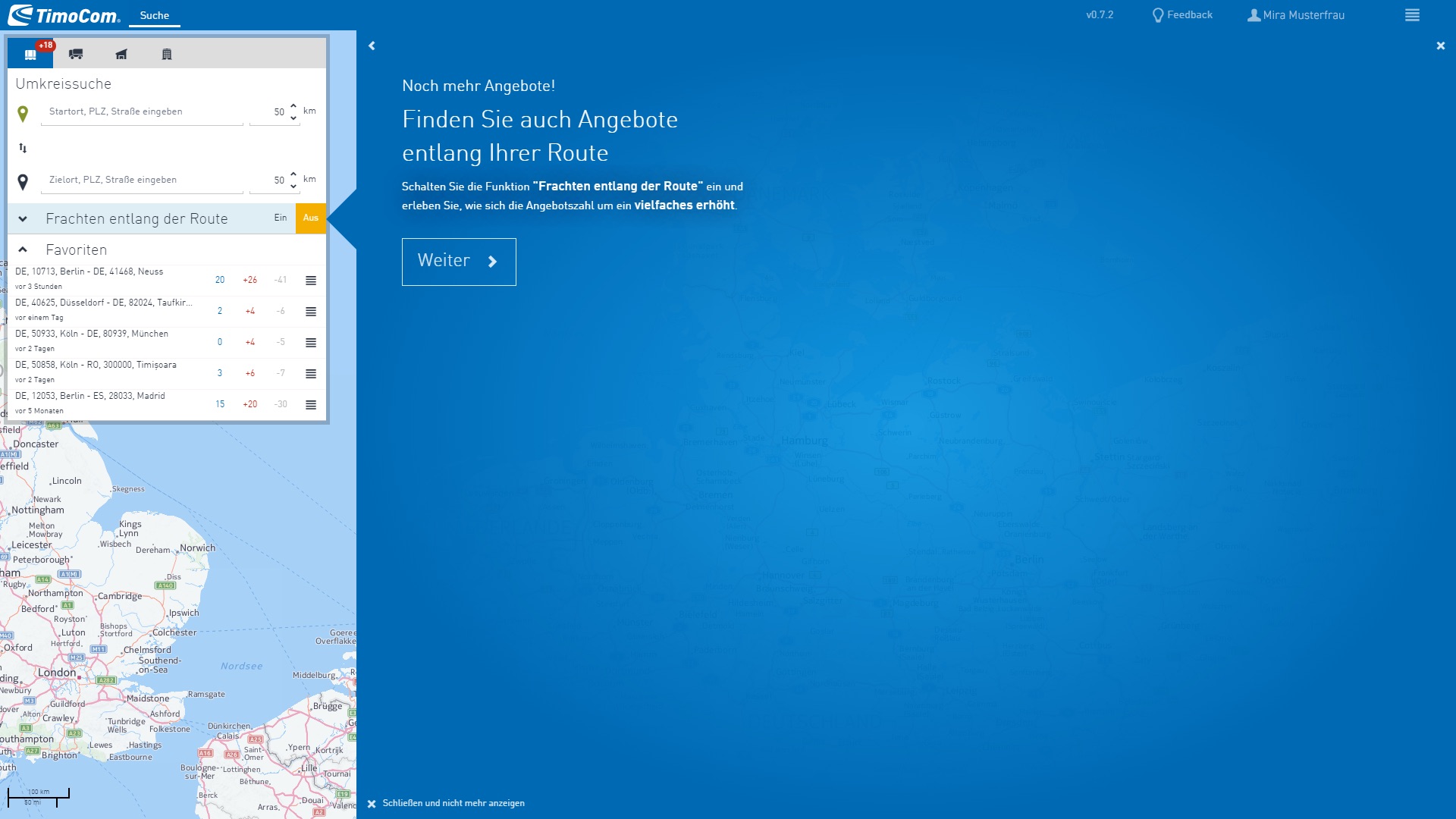
0. Onboarding
To make it easier for future TimoCom customers to get started with our offering, we have integrated self-running onboarding for first-time users for the first time. Previously, we often had to provide free on-site training so that our software could be understood and used by end users. The picture shows how we are promoting our most important feature in the future, the search along the route.
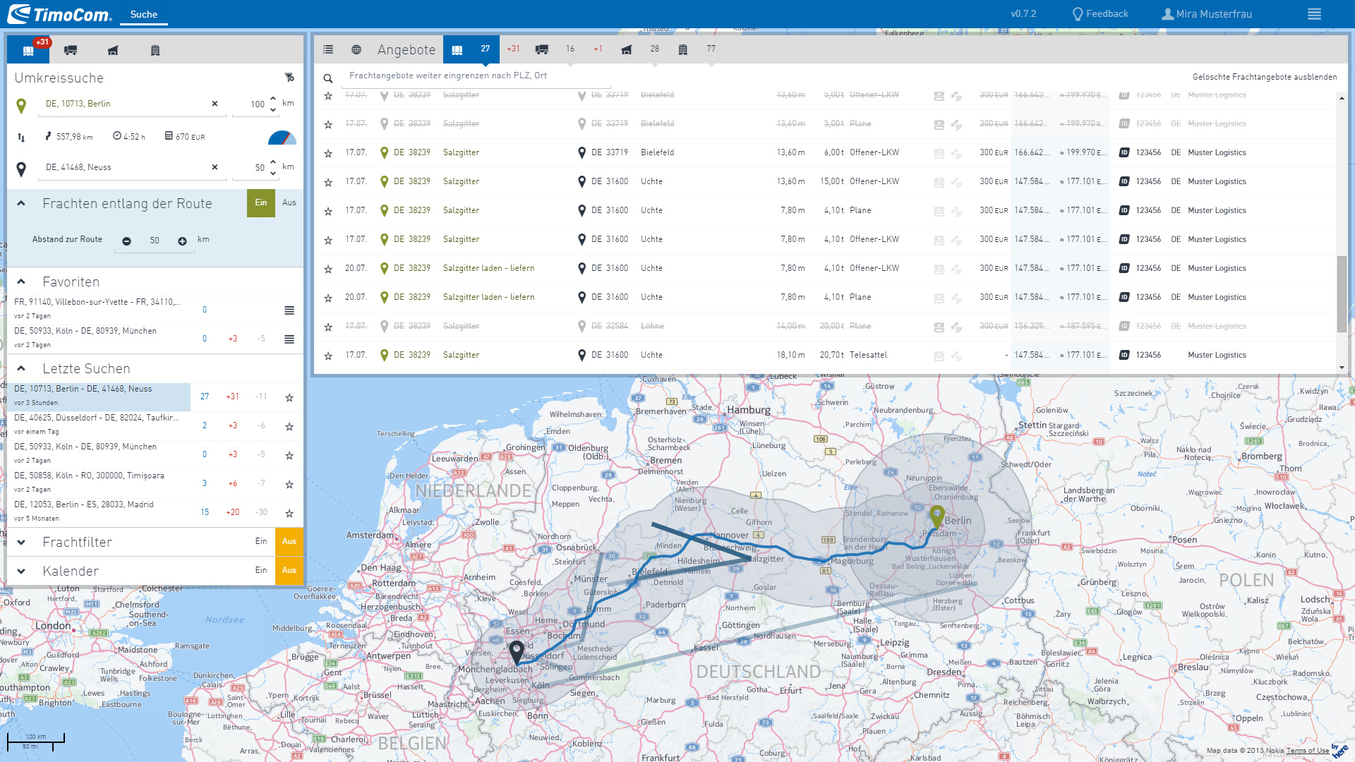
1. Search filter
In this screenshot you can clearly see that users can start their user journey with the search filter on the right. The picture is from a real test scenario. Using our information from user testing and an interface to the real backend data, we were able to get very close to the reality of our personas.
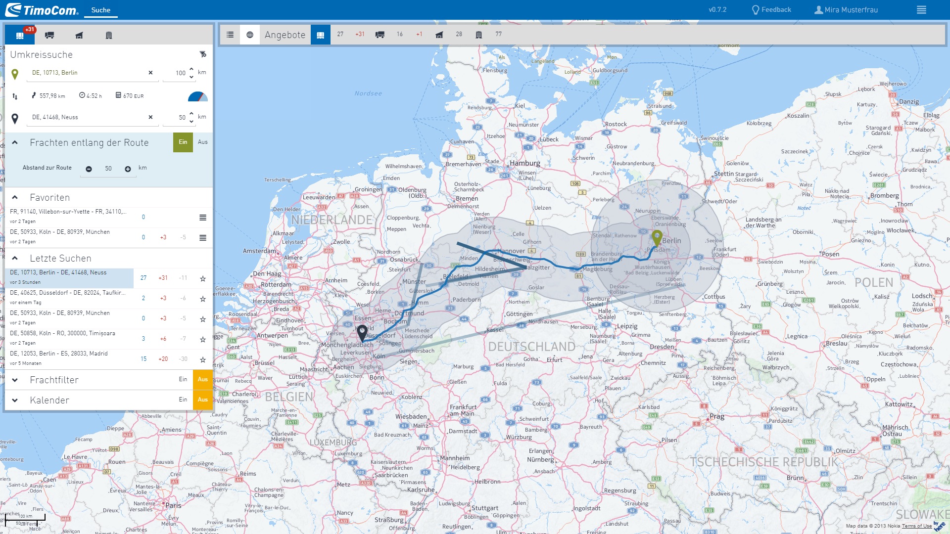
2.Map
The results list could be completely collapsed to give more space to the map. Nevertheless, users did not have to worry about missing out on a new offer. A series of notification badges indicated when a new offer had been added.
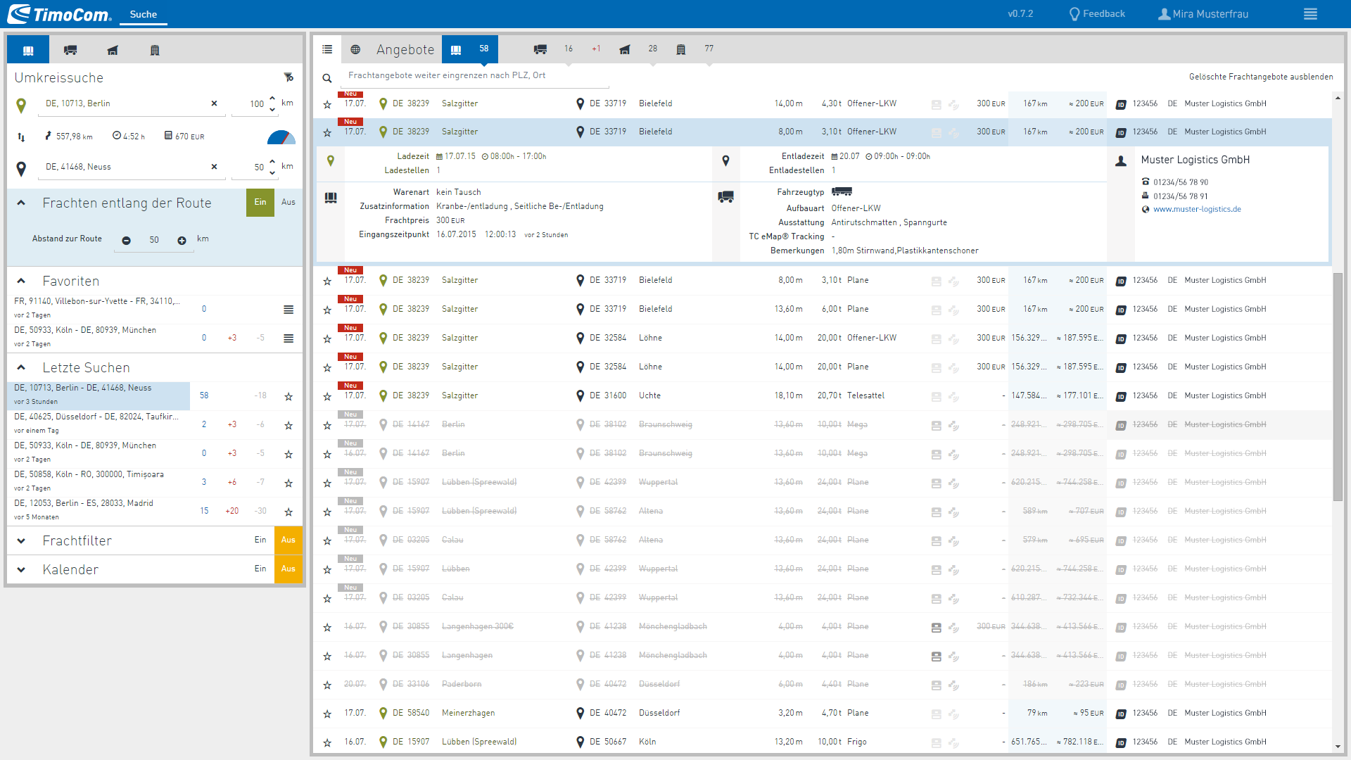
3.Offer details
In this screenshot above you can clearly see how detailed information about an offer is displayed below the list row. Previously, users had to leave the results list completely to access this information. Now they no longer had to worry about missing out on a new offer and the information was available more quickly.
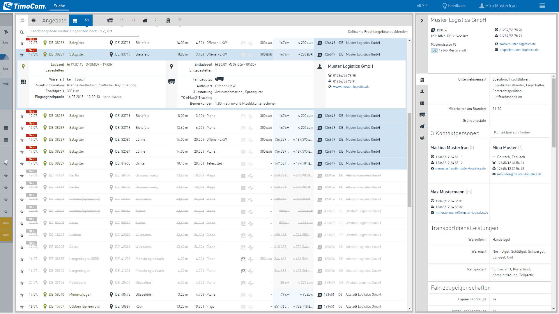
4.Company profile
When users checked the company behind an offer at the end of their user journey, they no longer had to display another window with a different application. I used the white space and all the information from TC Profile was displayed in the right column.
The little ID icon was a new product idea. Only TimoCom certified customers could receive this ID. This meant that decisions could be made more quickly and with more certainty to consider an offer.
As a special benefit to the user, the lines in the results list that came from the same provider were colored light blue. This meant that several offers could be negotiated quickly at the same time.
Next topic
Results & key takeaways
Results & key takeaways
Main business objective
As a team, we managed to create a new search that was able to easily find the small offers along a route. The main goal was thus achieved to increase the attractiveness of weak markets and thus to arouse new customer interest in becoming active on our platform.
Everything was ready to trigger the chain reaction of growth.
Never miss a new offer again
Due to the newly deployed web technology, new offers triggered the system as soon as they were received and were immediately visible to users in real time. Because we moved the search filter from the top to the left, there was more space to show when new offers on the goods side became visible parallel to the freight search. This was of course particularly interesting for the group of free logistic managers.
More security through better UX and IA
Offer details in the table
Previously, the results list was hidden when users clicked on an offer to see more details. With our solution, the details could be displayed directly in the results list. This prevented users from missing out on new offers.
Company details on the right
The result list of our design solution was fed primarily via API from the backend data of our freight exchange TC Truck&Cargo. The data from the TC Profile application was also available to us in the same way.
So we didn't have to open a new window to view the detailed company information. We still had space on the right side and our users could access the information there without having to take their eyes off the results list. In addition, it fit very well with the information architecture, as in most cases the user journey had its last step here.
With the new solution, all information could be collected and processed by our customers more easily, effectively and quickly
Integrated tracking
And since we now had a map in the center and the data from TC eMap, we could also integrate tracking into the user journey.
Inspire for more
New persona self-driver
With the help of the new responsive web application design, we were able to make this complex application usable on a tablet PC. In addition to our three main personas, it was suddenly possible to target another group, the self-drivers. There were many truck drivers who organised one or more tours themselves. They now also had access to our offers in their vehicle to avoid driving empty.
Side projects growth hacking
Many of the new technologies we used inspired us to create projects that we implemented in side Design Sprints. We have developed an app that optimizes grocery shopping for our canteen and increases the positive experience for our colleagues. Or the web app “GoPolly” to enable live polls during presentations. But I will present these case studies on a separate website.