AB tests @Rentalcars
AB tests @Rentalcars
[7 minutes read]
Company Profile
Name: Rentalcars
UK, Manchester, Travel, Enterprise, B2C
“At Rentalcars.com everything we do is about giving you the freedom to discover more. We’ll move mountains to find you the right rental car, and bring you a smooth, hassle-free experience from start to finish.” [rentalcars.com/us/about/ in 2021]
Main KPI: More bpd
Rentalcars.com had a very clear main KPI (Key Performance Indicator), increasing BPD (Bookings Per Day). When I joined Rentalcars in Manchester in 2015, a highly efficient A/B experiment platform was the key driver for success.
On this page I will share how I helped improveing the ideation & experiment process. I will also show some examples where the methods have proven to increase conversion.
Unfortunately, I can only show a few of the experiments for whose success I was solely responsible. In the fast-paced environment at Rentalcars, there wasn't always the opportunity to copy all the data. Many ideas were developed in teamwork and I was happy to support my colleagues in being successful with their ideas.
Ideation & experiment process
Ideation & experiment process
Process when I started
1.Inspiration
When I first started, decisions were made primarily based on gut feeling as to what could help increase the conversion rate.
Sometimes my teammates simply copied what worked for other teams. Of course, 'urgency messages' were a sure guarantee for a successful experiment.
2.Hypothesis
Once we had an idea of what we wanted to do as an experiment, we formulated it in the form of a hypothesis. As a rule, at least the last part of the following formulation was the same.
“If we change this, we will achieve this effect. “
3.Presenting
We met every two weeks for an ideation session with the cross-functional core team. Everyone had about three minutes to present their ideas to the team in hypothesis form. The hypotheses were then posted on a whiteboard in the form of sticky notes.
4.Voting
After the presentation, each participant had 2 minutes to cast their vote in the form of three red dots. We roughly evaluated the effort required to run an experiment. Finally, the team discussed how many of the hypotheses with the most votes could be scheduled for the next sprint.
The Product Owner had the final say.
5.Prototyping
Typically, the changes that needed to be made to prepare for the experiment were fairly minor. For this reason, hi-fi prototypes created with Adobe XD or Sketch were the exception. Lo-fi pencil and paper mockups were completely sufficient.
6.Handover
My job was to prepare the graphically more complex experiments in the form of code. This meant putting together small packages of CSS, JS and HTML code that had no dependencies on other libraries. I then handed this over to the developers in the form of a text file.
7.AB Test
Our experiments were published with other experiments on the self-built Rentalcars AB Test Platform. The proportion of traffic to be redirected to the experiment was decided depending on the type and possible risk. An online dashboard allowed live monitoring of how much more or fewer bookings an experiment caused.
Ab Test conditions & constraints
Quarterly team performance goals
Each team had quarterly performance goals. These were dependent on the group's previous performance. The PO had to mediate between what the team felt was realistic and what senior stakeholders expected.
Goals shared publicly
The quarterly goals were shared publicly with the other teams. It was also made visible how far away a team was from its quarterly target.
Success rate below 10%
A realistic performance goal could, for example, be to increase bookings by 500 per day in the quarter. That doesn't sound like much at first, since a successful experiment can quickly result in more than 100 bookings per day. However, the success rate was well below 10%.
Code freeze risk
Because of the high speed and strong pressure to succeed, code cleanliness wasn't necessarily at the top of the list of priorities. This sometimes resulted in a code freeze for weeks in order to maintain the system. During this time only very small changes were possible in order to carry out experiments.
Bias of multiple AB tests
In simple theory, AB tests are very logical, but in practice there are factors that need to be taken into account. We treated the numbers on our AB Test Dashboard as absolute truth. But it is also true that experiments influence each other, even if they take place at different points in the user journey. Unfortunately, one can only speculate about the influence of these effects on the numbers.
Seasonal effects
The time of year also had a significant effect on the AB test numbers. This was most noticeable as the most important travel time in summer approached. At the time we only had vague theories about the reasons for this.
AB Test performance measurement
Performance categories
A dashboard allowed us to see very precisely what number of more or less bookings an experiment caused. The number of bookings was divided into three categories, which were assigned to the colors red, green and gold.
<90 Red failed
If an experiment generated fewer than 90 more bookings per day compared to the published version, it was considered a failure. However, experience has shown that some experiments take some time and the performance could develop positively. In some cases it was worth waiting before making the decision to switch off an experiment.
≥90 & <95 Green open
In a green experiment that generated between 90 and 95 additional bookings per day, the PO was responsible for deciding whether to activate or not.
The closer we got to the end of the quarter, the sooner a green experiment was activated.
≥95 Gold successful
Gold Experiments, which had over 95 bookings per day, were the winners. When I started at Rentalcars, only between 5% and 7% of experiments fell into this category.
Good experiments had to be monitored for about two weeks before they were fully activated.
Next topic
Inspire for more
Inspire for more
1.Inspiration
This section is where the most improvements could be made. Here is the list of new sources of inspiration for good experiments that I brought to the team.
Copywriter
Especially if there is another code freeze, the copywriters' ideas can be the best. It was just great to help my colleagues create a gold experiment with simple word changes.
User researche
Rentalcars had an excellent user research team. Even though we didn't have access to a user researcher who was only responsible for our part of the user journey, it was worth it for our team that I built good relationships in this direction. Surprisingly, there was no need to beg for time for our group. It was more like the research team had a lot of user pain points in mind and wanted us to look at them.
Data analytics
Another team that didn't have to be asked for long to help us find problem areas and discuss possible solutions.
UI UX best practices
From a UX and UI perspective, the platform was decades behind best practices. There have been a lot of well-founded studies and data on why various changes can help get more bookings.
Accessibility
It's unbelievable how quickly you look past this topic. But yes, improving the contrast so that users can read text better increases conversion. There is a lot of potential in this area too.
Competitor analysis
It's simply a fact that competitors sometimes have better ideas than you. I also looked at what solutions the largest eCommerce platforms have to get inspired.
Sketching Workshops
In some cases there was an opportunity to think a little more about how areas could be improved. Then I took the opportunity to invite as many colleagues as possible from different departments to take part in sketching workshops.
Design community
And then of course there was the growing design community. Joint meetings to exchange ideas, regular lightning talks and design chat groups have produced many great ideas.
2.Hypothesis
Helping with preparation
Many outsiders had little to no experience with AB testing. In this part of the process I was able to provide support primarily with the preparations. It helped a lot when it came to including colleagues outside of our cross-functional team.
Lo-fi prototypes
But I was also able to help the core team find the true cause of a problem. Lo-fi prototypes could also help to communicate better what problems my teammates were trying to solve.
3.Presenting
Time to delve deeper
As I invited more teammates from other areas, it wasn't always so easy to explain the background of the problems that needed to be solved. Together we decided to take time to present background information on research results or to take a closer look at data from the analytics team.
4.Voting
This part of the process remained largely unchanged.
5.Prototyping
Working with the user research team
Here it could help to look at larger parts of the user journey to get a holistic view.
Accessibility
About halfway through my time at Rentalcars, a group was founded to focus on accessibility. Here I regularly coordinated with my colleagues of the group to improve my prototypes for the experiments.
Brand design
So that the guidelines of the Rentalcars brand design could slowly be reflected in the product, I worked a lot with representatives of the marketing department. At this point, the growing solidarity among designers also helped us to develop a design line for the Rentalcars brand.
6.Handover
Knowledge of building a small design system with Node and Gulp helped me deliver my code artifacts to developers with higher consistency and quality.
7.AB Test
Through my work, the topics of accessibility, design consistency and brand design were increasingly able to influence the decision on how to assess the course of an experiment.
Next topic
AB test: Competitor analysis
AB test: Competitor analysis
Code freeze
Rentalcars.com was a fast paced environment with individual responsibility of the product teams to reach high quarterly goals to increase bookings. Under these conditions, those who do the bare minimum in order to generate the maximum possible short term success will be rewarded.
As a result, after a long series of successes, the quality of the code has suffered significantly. During such a code maintenance crisis, the team asked me to develop only very small experiments but with enough potential to reach our quarterly goals.
Competitor research
By using Confluence from Atlassian, it was now possible to create huge but manageable tables combined with an appealing layout.
I used this new tool to set up a table in order to compare 30 different features/elements with 10 direct competitors, 17 biggest suppliers and 8 world best ecommerce companies. Altogether, I manually created a matrix of 1050 intersections.
Lowest hanging fruit
With this approach I was able to quantitatively compare the use of features and elements. This data made it possible to set up a recommendation matrix that helped to find the low hanging fruit with the highest impact and lowest demand on dev resources.
The best idea I found was to open the vehicle details in a new tab with a single line of code.
Hypothesis
“If we change the click behavior to open the car details in a new tab, users can compare the details of a car more easily. We can measure success if the change increases conversion.“
+103 bpd
This gold experiment brought +103 more bookings per day or more than 1.1M Pounds in revenue per year.
Next topic
AB test: User needs
AB test: User needs
User Research Team Request
As mentioned before, it was my responsibility as the UX Designer in the team to maintain the relationship to the global user research team of Rentalcars.com. Following recommendations from our UR team, made it more likely that an experiment was successful since we tried to solve a real user problem.
This time we were asked to do something to make it easier for our customers to compare the specifications of a car.
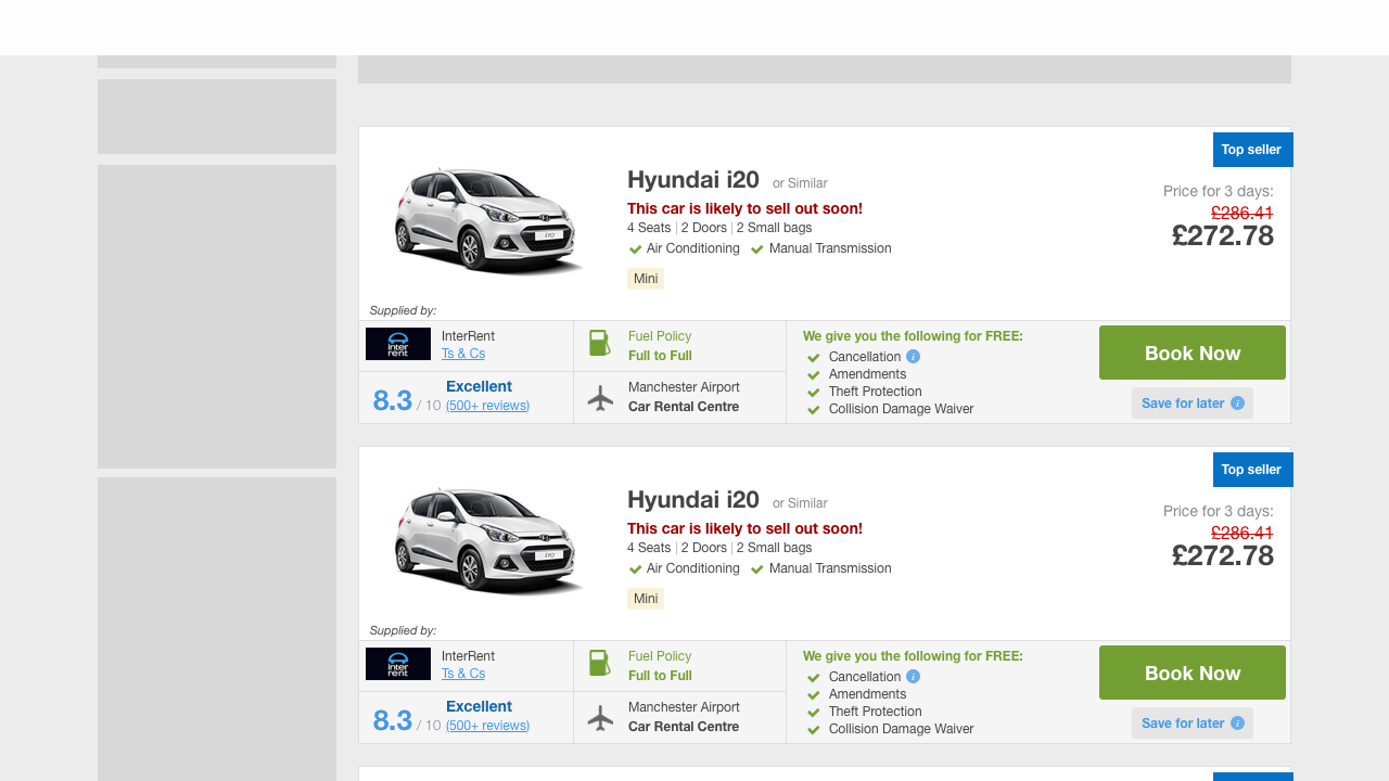
Previous design
Based on the previous design shown on the screenshot above, I created different variants with more or less changes.
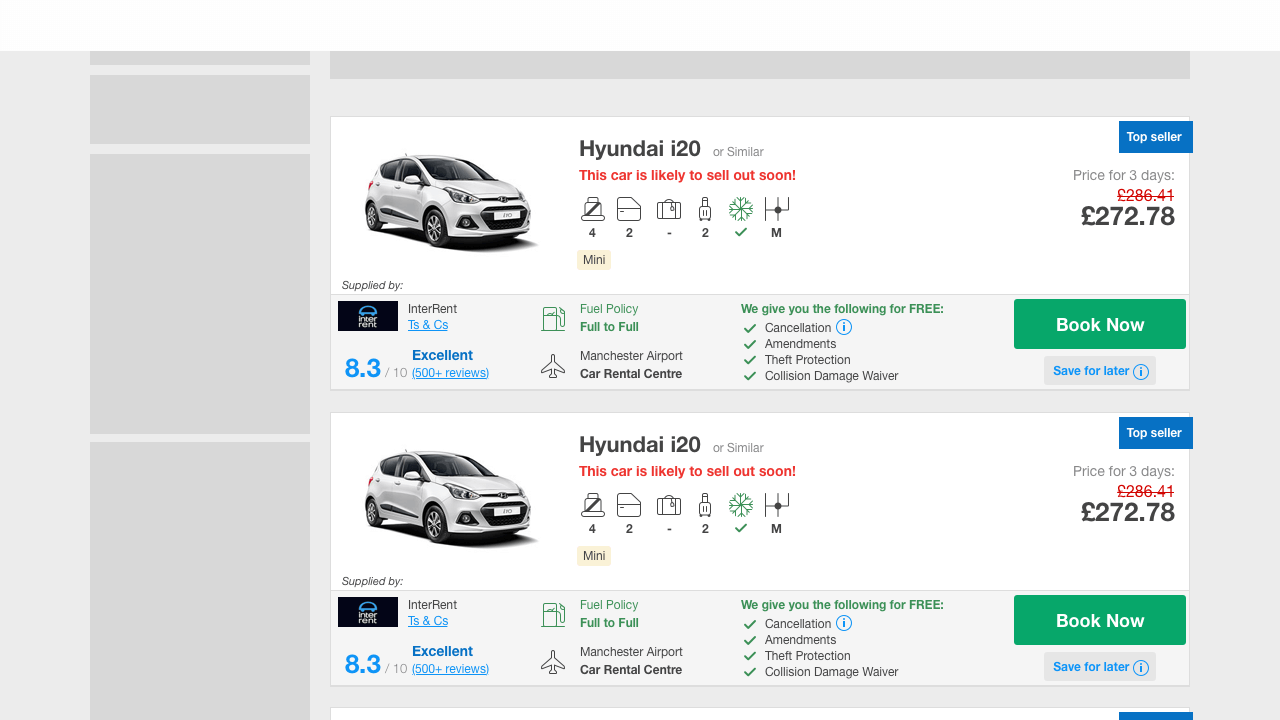
Try using brand design elements
The design shown above also tries to implement the brand design elements like the new icons and colours. Together with the product owner, we decided to take another prototype to start an experiment.
If we changed too much for the brand design, we would not know which element would have made the difference if it failed.
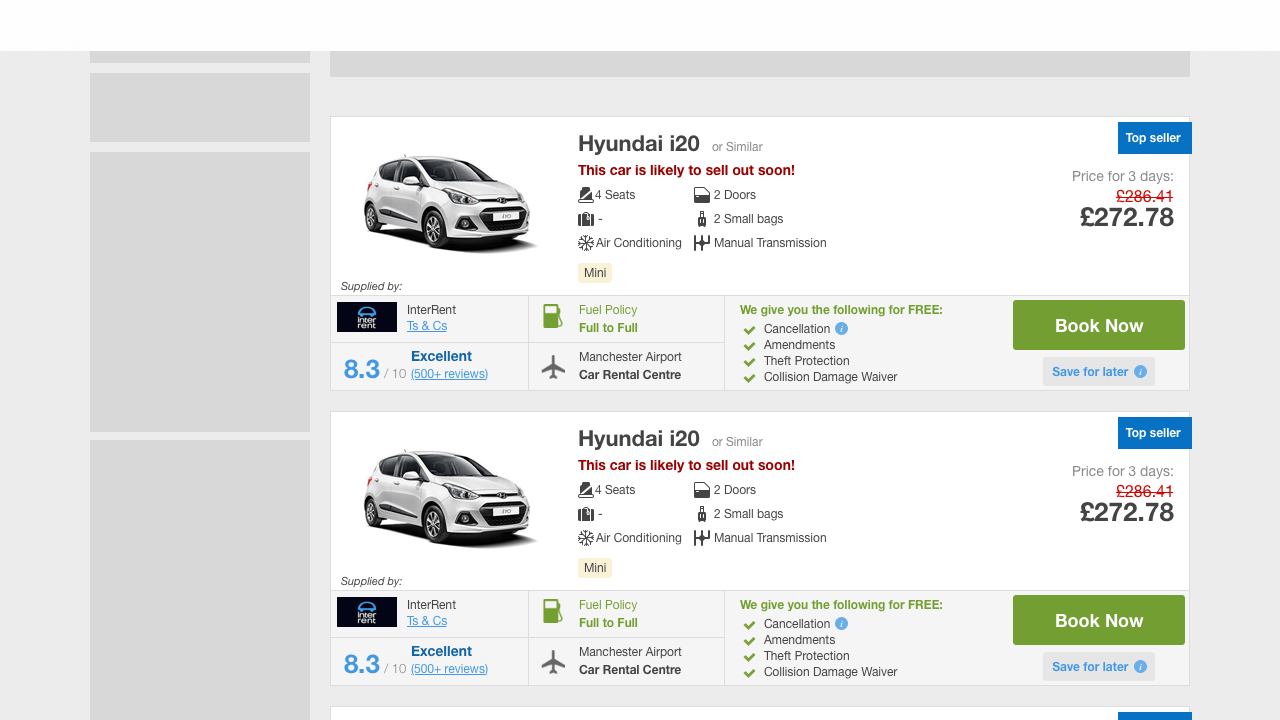
Optimised for low resolution
For changing the small area on the screen I was able to build on experience from vision prototypes I designed before and a set of low resolution ready icons I had created. When you scroll back to the top to the screenshot from the current page you can see that they are still in use after years.
Hypothesis
“If we use icons to create a clearer structure on our car card, then our users can find the information relevant to them more easily. We can measure success if the change increases conversion.“
+116 bpd
The experiment result was skyrocketing and brought us +116 more bookings per day or 1.2M Pounds more in revenue per year.
Next topic
AB test: Design vision
AB test: Design vision
Powerful source
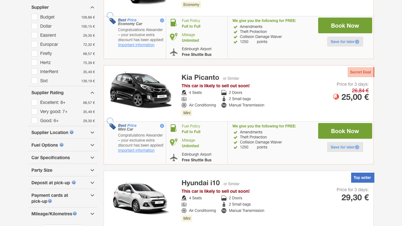
Earlier design visions are a useful source of ideas for powerful A/B experiments. On the screen above you can see a vision of a search results page with all filters on a similar design hierarchy level.
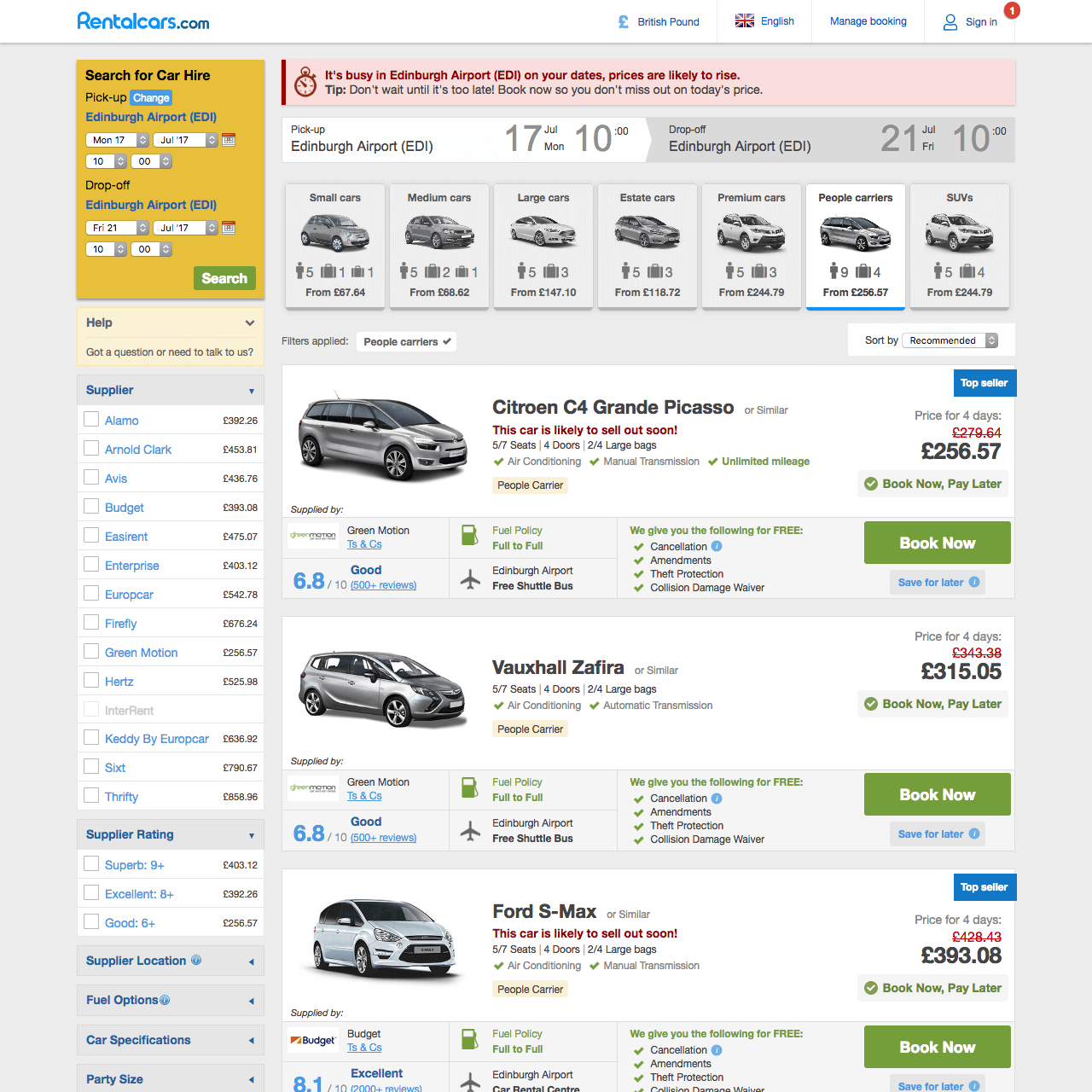
Previous design
In the image shown above you can see how the 'Supplier' filter on the right is clearly different from the 'Car type' filter above the car cards.
Design principles
The experiment wasn't as strong as hoped, but it was in the green and in consultation with the PO it was released for the whole user traffic. From a design perspective, we were just happy that it was occasionally possible to follow coordinated design principles.
Hypothesis
“If we can better guide the user where to find which elements to interact with the filter by clearly structuring the focus levels by changing the background colors, our users will be able to more easily make the settings they need to find the car they want. We can measure success if the change increases conversion.“
+92 bpd
At least this experiment was bringing +92 more bookings per day or nearly 1M Pounds more in revenue per year.